
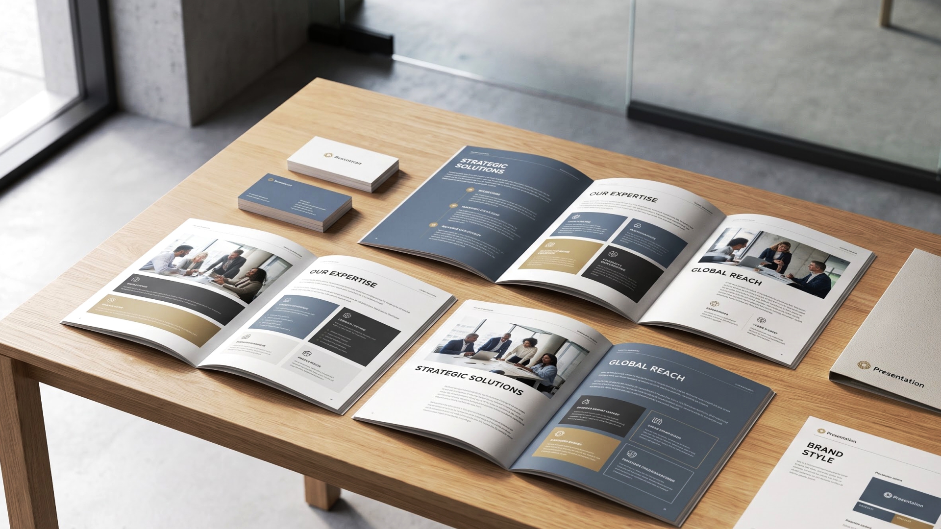
With social feeds and paid ads taking center stage in the marketing world, a well-designed brochure remains a standout. A printed piece that hits the hands of the person that you send it to, has a physical presence that a scrolling add cannot replicate, and that's why smart companies just keep on investing in brochure design services as part of their marketing mix.
Unfortunately, most brochures are not successful before the first person reads word of copy. They're either so full of text that they feel like homework or so commonplace that they fit in with all of the other pamphlets on the counter. The design is what makes you worthy of being read, for instance when you're creating a corporate brochure design for a boardroom pitch or a marketing brochure for a trade show table. A brochure that's picked up, opened and remembered is a brochure that's worth having so here are some tips that will make it that way.
Clean doesn't necessarily equal boring. A simple design, generous space, and limited color and typography all tend to convey confidence and professionalism more successfully than a busy page. It is particularly effective when you have to establish credibility (a corporate brochure), as you don't need to fight for attention with graphics.
Simplicity also lends your brochure to be scanned easily, and this is important if your reader only has 10 seconds to make up their mind about whether your brochure will interest them enough to read further.
A brochure isn’t a static image it’s an object people physically interact with. Consider the content of each fold, the content revealed when opening the cover, the first content that is in the view of the readr, and how the layout is guiding the readr through the piece. Incorporating a little surprise, such as a color change or a surprising image, adds some life to the experience.
Simple geometric shapes, callout boxes, angled colored blocks or large cutouts can guide the eye just where you want it. They can make key messages stand out when used judiciously, without the addition of extra copy. This is easy to apply, and despite the fact that it doesn't involve any special printing process, it does involve some creative layout decisions.
Not all brochures have to be booklets (bi-fold or tri-fold). Accordion folds, single continuous panels, or odd shapes allow your readers to enjoy your content in a different way – either by unfolding page by page or by unfolding all the way to see it as one visual statement. It's a memorable way to stand out from the typical pamphlet format and make a lasting impression on your brand.
Great brochures sometimes tell a story through the brochure itself. Good, sharp lines can help to sustain a dynamic brand, while rounded, soft edges can help to hold a friendly, inviting brand. If the physical composition of the piece is congruent with its content, the entire design is not incidental, but intentional—a characteristic of well-thought-out business brochure ideas.
Use a fancy envelope when sending a brochure with a physical add-on, such as a sample, a card or a small item. Create a design that will make the insert feel like a reveal and not an afterthought. It creates interest and provides motivation for people to investigate all aspects of the piece.
There are some fantastic brochures which completely transform from the flat page by folding into pop-up forms or interactive shapes that require hands-on involvement. This type of format incites curiosity and makes an impression, particularly for brands in creative businesses where a regular trifold brochure would look awkward.
The pages do not have to be standard rectangle-shaped pages. Circular shapes, layered or custom die-cut shapes can give interesting reveal effects as readers progress through the piece, adding information layer by layer that flat pages cannot. It's a little structural detail that makes the design of an effective brochure look handcrafted instead of mass produced.
Rounding off corners or some other small detail can change the feel of a piece from cold and sterile to warm and welcoming. This sort of light editing can be done with warm colors and a welcoming palette, creating a brochure that is more approachable to pick up.
Your copy speaks as loud as does paper stock. Sustainability and warmth is suggested with recycled paper and textured paper, while heavier paper and glossier paper indicates polish and premium positioning. This is a little detail that can be overlooked, but it's definitely a visual one that can easily be noticed when meeting a brand in person.
Not all the time photography is the answer. In certain cases, an abstract textural graphic can be more effective than a literal photo, particularly when set against a strong backdrop that will provide contrast and dimension — for example, with palettes, materials or textures.
Illustrative, bright colour and interactivity with a die-cut accessory readers can remove from the brochure is used to make a brochure something people want to keep, not throw away. This is a great solution for brands that target younger audiences and for lifestyle brands that need new business brochure ideas that aren't as business-like.
Don't assume that a large brochure is necessarily effective. A mini-sized, well-packaged item that fits in the pocket/bag will be more likely to get through the day as compared to a largish item that is left behind. A smaller size may actually help to have your brochure stay in circulation longer, if you can get your message down to a succinct format.
The majority of brochures will be consumed in a page-by-page, left-to-right fashion. Breaking the mold such as a single dominant panel with foldable flaps for branding can cause your piece to stand out just by not looking like the rest of the pieces on the table.
Typography can be in non-straight horizontal lines. Text that is at an angle can also guide the eye toward a focal point and stimulate an otherwise static page over a pattern or background.
A die-cut window that reveals just a portion of an image underneath creates intrigue — readers see enough to be curious, but not enough to get the full picture without opening the piece. It's a simple production technique with an outsized impact on engagement.
Consider the brochure's placement, not just handout counters or racks, but counters, racks, and stacks of handouts. If you want your brochure to be a professional presentation for any business event, or for any retail space, then it's really important that you have a companion piece of artwork that shares the same visual identity as your brochure
Creating a few variations on the same brochure (variations in photos, colors, etc.) can help to provide your audience with a choice, and can help to make your display appear richer. It's a gentle approach to determining what works best visually for your audience.
Wherever possible, consider using physical elements to convey ideas of transformation, change, or progress in your message; for example, a fold, a reveal, or a change in the structure of the piece. Sometimes the basic visual or structural rethinking will reveal design ideas you did not come up with using the copy
Pages that carry no text or images can still serve a purpose. Used as visual breathers between content-heavy sections, they help readers process information in digestible chunks rather than feeling overwhelmed by page after page of dense material.
Pages of text or graphics can be useful even if there is no text or graphics. They can be employed as visual breaks between content-focused paragraphs or blocks of text, allowing readers to absorb the material bite by bite, rather than being overwhelmed by a whole page of information.
Extras like a fitted sleeve, spiral binding, or protective case elevate a brochure from disposable handout to a piece that feels considered and valuable. These small production choices are especially effective for a corporate brochure meant to leave a lasting, premium impression.
Even a standard folded format can feel fresh with the addition of angular cuts or an envelope-style closure. It's a subtle production technique that adds sophistication without requiring a complete structural overhaul.
Rather than placing text and photography as separate elements, try reversing type out of an image so the letterforms themselves carry visual texture and color. It's a technique that makes both the typography and the photography feel more intentional and unified.
The best business brochure ideas often go beyond simply presenting information. A brochure that unfolds into a usable map, poster, or reference tool gives your audience a reason to keep it around long after the first read. Functional design continues to be one of the most effective trends in print marketing.
A strong brochure isn't defined by how much information it holds — it's defined by whether someone picks it up, opens it, and remembers your brand afterward. Whether you're working with a design agency offering professional brochure design services or building your own marketing brochure in-house, the principles are the same: simplify your message, design with purpose, and always keep your reader's experience at the center of every decision.
Apply even a handful of these tips and you'll have a brochure that does more than hand out information it actively promotes your business.
