How do consumers select? They select on bases of color, feelings, and minimalism, Imagine walking through a crowded marketplace filled with hundreds of businesses competing for your attention. Some logos instantly feel trustworthy and useful. Others seem exciting, luxurious, or innovative—even before reading a single word.
What creates this immediate connection and interaction?
The answer often lies in color combinations that influence perception.
Colors are not just simply decorative elements. They are Gentle storytellers. They direct emotions, guide decisions, and create lasting impressions. The most successful brands understand that choosing the right colors is not an artistic accident but a carefully planned Color psychology Strategy.
If you're building a startup, redesigning your company identity, or creating a personal brand, understanding Logo Color Psychology, Color Theory, and Color Harmony can transform an ordinary logo into an Iconic brand identity.
The Secret of Colors
Every color carries a message, an aura for the eyes, and a feeling for the heart.
Before customers read your Tagline, visit your website, or to experience your products, they react emotionally to your Seen identity. This reaction is known as the Color Impression your brand creates.
Here's something interesting.
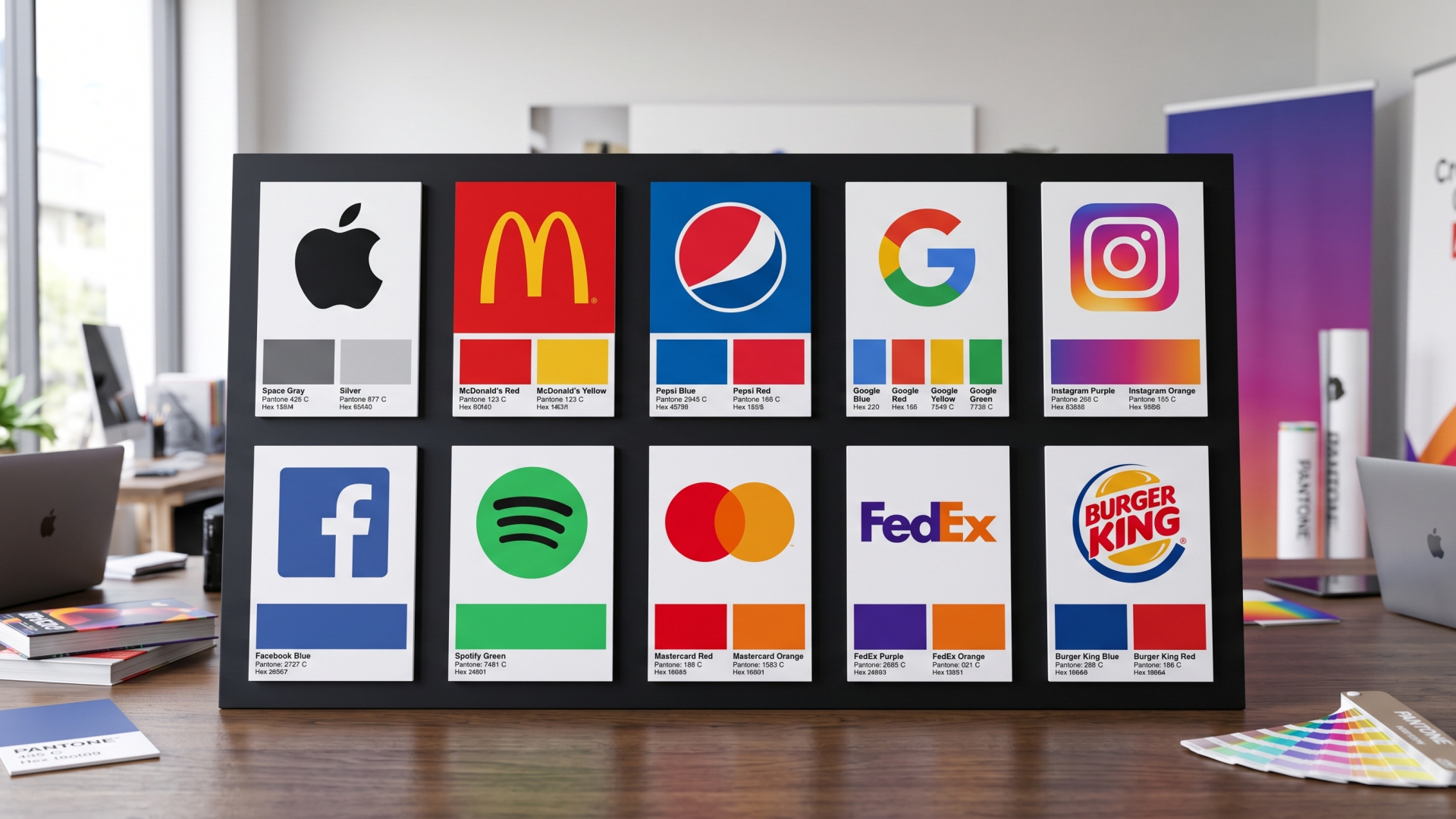
Bright yellow is often associated with: Optimism, Happiness, Friendliness, Confidence. This color logo feels different from a black one. A deep blue logo creates a completely different experience than a vibrant red design. It is all about color psychology.
This isn't a coincidence. It's psychology.
The feelings of colors have influenced human point of view for centuries. Today's brands use these emotional associations to create stronger interactions with their audiences.
A well-chosen color palette can make a brand feel more authentic, Inspiring, and Unforgettable.
A poor color choice can confuse customers before they even understand what the business has to offer.
Why Great Brands always Choose Colors selectively
Many business owners select colors based on personal interest.
"I think blue is good."
"My wife likes Red."
"Green is my favorite color."
While personal taste matters but successful Visual Branding requires a deeper strategy as well.
Professional designers understand that colors must align with:
This is where Professional Logo Colors become more than visual Factors —they become communication channels.
The smartest brands don't simply choose colors.
They choose aura, vibe, emotions…
Understanding Logo Color Psychology
Every color speaks a unique language.
Blue: The Color of Trust, Loyalty, Security. The color of the infinite sky.
Blue is one of the most widely used colors in branding because it communicates trustworthiness, confidence, and intelligence.
When customers see blue, they often associate it with stability, faithfulness and professionalism.
This makes blue an Effective choice for:
Blue says:
Committed to earning your trust
Red: The Color of Action, Passion, Excitement, Strength. The Color of Her.
Red demands Consideration.
It creates urgency, passion, excitement, and energy. It is bold, fearless, and hard to ignore.
Brands seeking a Dynamic personality often use red to create emotional and spiritual intensity.
Red says: Just do it
Yellow: The Color of Optimism. The Color of Krishna.
Yellow Shows positivity and creativity.
It captures attention while communicating warmth and enthusiasm.
Brands that want to appear friendly and creative often select yellow into their identity.
Yellow says: Something exciting is happening here.
Green: The Color of Growth, Prosperity, Sustainability. The Color of Nature.
Green symbolizes balance, health, nature, and sustainability.
As consumers become environmentally conscious, green has become one of the most meaningful colors in modern branding.
Green says: We care about growth and wellbeing.
Black: The Color of Authority, Sophistication, Luxury. The Color of God.
Black represents elegance, sophistication, and power.
Luxury brands frequently use black because it creates a stunning visual presence that feels timeless and trendy.
Black says: We stand above the Standard.
The Science Behind Color Theory
Color Theory is the science and art of using colors effectively in design and communication.
In the emotions that drive reactions, Color Theory provides the structure behind successful design.
Color Theory helps designers understand how colors combine with each other and how they influence visual perception. Without this theory, logos can appear confusing, overwhelming, or forgettable.
With this color theory, brands can create a harmonious visual experience that feels natural and charming.
This is why successful branding combines creativity with strategy.
It is both art and science. It is an articulation of science.
Color Harmony: Where Magic Happens
A single color can create emotions and feelings.
A combination of colors can create identity, strengthen brand perception, and improve connection.
This is where Color Harmony becomes essentially inevitable.
When colors work together effectively, they create balance, consistency, and visual appeal.
Some of the most successful Color Palette Ideas include:
Blue and Orange
A powerful combination that balances trust and creativity.
Blue provides stability while orange introduces energy and innovation.
Together, they create an Innovative and approachable brand image.
Black and Gold
Luxury. Prestige. Excellence.
Few combinations feel more sophisticated than black and gold.
This pairing instantly creates a premium perception.
Green and White
Simple, growth full, fresh, and natural.
This combination works particularly well for wellness, herbal brands, sustainability, and organic brands.
Purple and Gold
Innovative + Elegant.
This pairing creates an Iconic identity that feels imagined, reality and refined.
Visual interaction Without Words
One of the most fascinating aspects of branding is that customers often understand a business before reading anything. Exclusively on Insights. Unique information. Exclusive content. This is the power of Visual Communication.
Colors patterns communicate messages faster than text.
They influence mood, shape expectations, and guide perceptions within seconds and help decision making.
A customer may not consciously notice your color choices, but their brain certainly does, willingly, unwillingly, consciously, unconsciously inevitably.
That is why the most successful brands invest heavily in creating consistent simplistic visual systems.
Their colors become part of their identity.
A long time in the future, customers will recognize those colors instantly.
This is how brands become memorable.
Creating an Legendary Brand Experience
The goal of great branding is not simply recognition.
It must be an emotional connection.
A Legendary brand is one that creates a feeling people remember long after they leave a website, store, or advertisement. It is retrieve, retain, recall.
Color plays a critical role in this process.
The right color combination can make a business present:
Every color choice either strengthens or weakens that perception.
The difference between a good logo and a remarkable logo is often strategic proper color selection.
The Future of Colors
As digital platforms continue evolving, developing brands are becoming more intentional about color choices.
Modern businesses are moving beyond trends, fashion and focusing on emotional relevance.
Instead of asking:
"What colors look good?"
They ask:
"What feelings do we want people to experience?"
This shift is creating more authentic and impactful branding experiences.
The most successful companies understand that colors are not just decorations.
They are emotional triggers.
They are business tools.
They are storytelling devices.
And when used correctly, they become one of the most powerful assets a brand can own.
Final Reflection
The best logo color combinations are not chosen by chance. They are built through understanding Logo Color Combination, Brand Color Strategy, Color Theory, Color Harmony, and the emotional power and information behind the feelings of colors.
colors that communicate purpose, personality, and values.
Whether you're creating a startup logo or refreshing an established brand identity, remember this:
Colors and patterns are often the first conversation your brand has with the world.
Make that conversation Vibrant, Effective, Creative, and Inspiring.
How did your brand make them feel?
“When Colors Speak Without Words”